
Some time ago, I wrote how admin here at the University of Not-Bielefeld (if not admin types the world over) like to send chain e-mails, where some e-mail from central admin is successively forwarded down the chain of responsibility (central admin to faculty to department to …) with no one bothering to clean up all the forwarding details along the way. The end result for the sucker on the end of the chain is an unnecessarily long e-mail that begins with “do this” followed by roughly 30 minutes of scrolling to see what actually needs to be done. (Which is usually to click “delete”.)
Well, central admin here at the University went one step better and have now developed chain-link e-mails …
An e-mail came around the other day announcing the exciting news that the President’s Office had established new, formal guidelines for the “standardized wording” of the university address to be used on all scientific publications. And to see the guidelines and additional information, all you had to do was to simply click the link provided. (I know. Already sounds like a phishing e-mail, doesn’t it?)
Only problem was, clicking that link took you to a University webpage that merely repeated the content of the e-mail but with another, different link to actually get to the guidelines. In other words, one pointless click too many: why not just (also) include the guidelines as an attachment to the e-mail in the first place?
In reality, however, it was two pointless clicks too many …
… because the guidelines basically amounted to nearly three pages of the pretty damn obvious. And the all-important, Standardized Wording boiled down to the this:

- the name of the university always has to appear in the address and then always as the full name in German (e.g., Baron Munchausen Universität Nicht-Bielefeld; sorry, apparently I’ve been a little lax on this until now) and
- e-mail addresses always have to be the work e-mails of university employees, not private ones.
Everything else like the departments and working groups? Who cares! Choose any order you like and feel free to use either English or German. Just make sure to use the full German name of the university.
Seriously? It took them 19 days and two links to inform us of guidelines equivalent to that we should be putting our socks on before our shoes?!
Ostensibly the whole reason behind this move is so that publications from the university are easier to find and to associate with the university. Carrying on, this information can then be used to more easily collate data on how productive both the university as a whole as well as its academic staff have been.
Again: seriously?
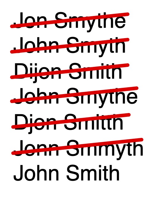
For one thing, it’s really not that difficult for computers, even before the dawn of ChatGPT and the hovering apocalypse of AI, to hone in on variants of something like the name of a university. I know this for a fact because my last name is prone to many weird, wonderful, and downright creative misspellings, yet Web of Science as well as Google Scholar have managed to associate most of them with my real name. It’s even easier with many German universities (worth mentioning) because they carry both the name of a famous historical German figure (always male; no famous German women, I guess) as well as the city it’s located in.
For another, it’s only suggested in the guidelines that the authors use a standardized name under which to publish. But, if one of the express goals of the guidelines is to associate papers with both the University as well as with individual academic staff, then shouldn’t this be more than a mere suggestion?
In reality, the guidelines have more to do with the University’s blossoming love affair with corporate design than anything else. In the past 10 years or so, they’ve redesigned the University’s logo twice, with knock-on effects on everything it was used on like letterhead and PowerPoint presentations. But because the first update was essentially ignored. they went to extra lengths to make people aware of the more recent one. This included releasing a promotional, teaser video filled with all the empty advertising buzzwords they could think of before the official unveiling as well as a 58-page user manual on how to properly implement it on everything from flyers to brochures to business cards to certificates and diplomas to academic posters and presentations.
Despite all this, the second update is receiving about the same amount of attention from me that the first one did in general. Really the only areas for me where it’s relevant are my slides for teaching and for scientific conferences. (Do people even do business cards anymore, especially in Academia? I purchased like 200 of them from the University when I first arrived, overly keen, 15 years ago and have about 197 of them left, all with the wrong corporate design now too.) Before, when there was no manual to again guide me through the obvious, I simply put the University logo on the first, title slide of each presentation. But the new guidelines now stipulate that the corporate design has to be used on each and every slide. Why? My natural expectation here is that the audience is there for the scientific content rather than knowing where I work or teach (and my sincere expectation is that the students already know which university they’re at) and that they’re clever enough to remember it having seen it once. Having the logo as an ever-present sidebar also means that there’s that much less space for real content. More personally, it also means that I have to redesign more than a thousand slides, both because of the loss of space but also because the new corporate design has only been implemented for PowerPoint slides in widescreen format, which I don’t use. (And which is generally useless for teaching because the projection areas in most of the University’s classrooms were set up for the much squarer picture that was the default before widescreen. So now you’re trying to fit an overly wide picture in an overly narrow space making for some overly small text.)
I figure if the University has the time and money to redesign their logo every couple of years AND now to make promotional videos about it, then they can also invest some of the same to hire someone to redesign my slides as well.
Unless, that is, they’re already working hard on the next set of corporate guidelines and redesigns …
