
Forms are synonymous with admin. And forms are simply awful. Period. (Although most people would agree with each of these sentiments, I strongly suspect that they have never contemplated the logical consequence of linking them together.) There is, of course, the pain inherent to any form in and of itself. However, there’s whole bunches of other, generally avoidable aspects to forms that help dial this pain up to excruciating.

Computers, as in all other parts of modern life, have revolutionized this process through the advent of electronic forms: more pain, delivered more efficiently than ever before. And, even German admin has hit the ground running in replacing the previous, prehistoric system of paperwork with an efficient electronic one. And, in these pandemic filled days, just in the nick of time too to help maintain the air of “business as usual”. Unfortunately, however, that’s often “hitting the ground” in the way a drunk would seconds after passing out …
(As a point of clarification, I’m going to distinguish between electronic forms that you download and fill out on your computer and web-based ones. I’m only talking about the former here because the latter generally tend to work.
Which might also explain why my University doesn’t use them. Just a thought …)
Now I actually prefer electronic forms to paper ones. The latter are simply not made for my overly large and error-prone handwriting and with the electronic ones I automatically have an environmentally-friendly copy that takes up no space whatsoever. Nevertheless, my relationship with electronic forms tends to be of the love-hate sort of variety because they often seem to be made by the same admin types who previously mangled the paper ones and now get to showcase their lack of basic computer skills to boot. The only increase in efficiency is how many extra problems they can now build in.
But, paper or electronic, Microsoft Word or PDF, take your pick and choose your aspirin wisely …
- Brain-dead formatting
 We all know this from paper forms: unless one is able to write on a grain of rice or just happens to be generally adept at, say, writing microdots, some of the spaces are just way too small for a fraction of the information that is supposed to go in there. Fortunately, however, no one expects you to colour within the lines after age five, so you could always continue scribbling outside the box and over all the surrounding text for the admin types to try and decipher later. (Yes, Virginia, there is a payback sometimes …)
But electronic forms, with their pre-defined fields, are so much more versatile here …
Usually the fields are active. Or at least that’s the idea. But, sometimes they’re not and you can’t scribble over, above, around, or even in them like you could on paper. Or the fields that you can fill in automatically scale the font size according to the amount of text you enter, making for a typesetter’s nightmare with all the different font sizes. Even worse: not doing this scaling (or scaling of the size of the field) because the creator of the form knew beforehand just how long every answer should be. Answers that are too long, therefore, either can’t be entered in their full length or run unreadably off the side of the field, the 21st century’s version of having to write your entire address in a box that’s just big enough for your postal code.
- Endless updates
Taking their cue from google and Firefox, the electronic forms at my University undergo a seemingly endless stream of updates. One can only assume that that extra, discretionary comma added between versions x.x.x.7 and x.x.x.8 must be really, really important to someone.
And, to some admin types, it must be because their policy is to accept only the absolute latest version of any form.
How endless are these updates? Well, one specific form here at the University of Not-Bielefeld deals with hygiene measures related to the pandemic. Through the first eight months of its lifespan, this form was already into its fourth major version (4.x) and who knows how many minor tweaks within that. Now I realize that the speed with which the pandemic took hold in the Spring of 2020 caught nearly everyone flatfooted such that teething problems and the requisite improvements were inevitable. However, some simple proofreading (or just plain ol’ thinking) would have helped too. For instance, the form in question mostly consisted of a bunch of yes / no checkboxes (see #4 below) as to whether specific hygiene measures had been implemented. If the answer was “no”, then some additional explanation was required as to why not. But, some of the questions were essentially phrased in reverse meaning that “no” actually meant “yes, we did it”. But, if you took the instructions to heart, you are then obligated to explain why, for instance, wearing face masks or using disinfectant is a good idea.
(Remember this form. We will, unfortunately, be coming back to it. Again and again and again …)
Unfortunately, this kind of black is white, up is down mix-up is hardly an isolated incident at my University and has plagued any number of its forms. It’s perhaps not surprising then that the first few major updates to this particular form were more concerned with those discretionary commas rather than this indiscretionary logic.
And don’t even get me started on the forms with which I have to register my teaching each semester. A decade on and my teaching schedule is more or less fixed: same courses, same rooms, same times. (Different students, but same confused expressions.) What aren’t fixed are the forms. Every semester it seems like they tweak some little unnecessary box, add that extra comma, or just simply change the layout so that you can’t re-use the same forms from the last time (just adding one to the year), but have to re-enter all the data again and again and again because only the latest form will do.
- A central repository
This is actually an example of a good idea that was ruined by trying to make it better. Time was when all the forms my University had to offer were scattered randomly, cryptically, and gratuitously across the many, many webpages of Central Admin. So, even in those rare cases when you knew exactly which form you needed, actually finding where to download it from was often a multi-day adventure.
 Enter the good idea: to combat this entropy and to return all the lost souls from the wastelands of cyberspace, my University set up a central repository containing every single form and associated set of instructions ever dreamt up by its admin team for your categorized, one-stop shopping experience. The West Edmonton Mall of forms as it were. (For the non-Canadians out there, think Mall of America. Same idea, but we did it first and it’s still bigger.)
So far, so good. But to make this good idea better, Central Admin restricts what parts of the mall you can visit to access only those forms that they think you need. Teachers get access to teacher forms, students to student forms, and so on. It’s not that I’m a formspotter or anything, but sometimes I need more forms that Central Admin would like to have me believe.
Usually these are the student-related forms. Even though we teachers are generally as hopelessly ignorant of the ways of admin as they are, students still seem to think that we can help them out here. (I wish that I understood what admin wants of me sometimes, let alone of the students.) Before, and with more than a little bit of luck, I could simply give the students a copy of the form that they needed. No more and I have to instead try and describe it to them based on the last version (now probably 3.7 updates old) that I laid eyes upon.
Oh and remember that part about only the latest forms being acceptable? The repository politely provides some of the forms to some of the people, but none of the version information to none of the people. So, each and every time we need a form, we theoretically need to go and download a new copy just to be on the safe side.
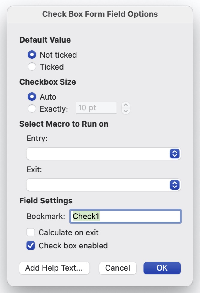
- Checkboxes in Microsoft Word forms.
A simple, short, sincere appeal: please, please, please can we just directly tick the box instead of via the pop-up window that always and very slowly comes up after having to double-click it? Or even just control-click it? Ever fill out a Word-based form with more than three checkboxes and you’ll know what I mean.
- Write protection. (Or, more accurately, wrong protection.)
Why, why, why?
Unlike some of my more annoying students have done to my questions on their final exams, most teachers really don’t have the desire to also go about correcting the typos on the forms that we have to fill in. Or just changing the form in some simple, random fashion for some simple, random reason. It’s usually more than enough work just filling out the damn thing.
Dunno. Maybe the creators are simply proud of their work, although it’s sometimes hard to see why. There’s been more than a few electronic forms that I’ve had to sign digitally in this, the Age of the Home Office, but can’t because they’re write-protected. I can fill in all the blanks that they want me to, but not all the ones that I want me to. The simple solution, of course, is to remove the pointless lock. One actual, suggested “solution”, however, was to print the form out, physically sign it, scan this signed copy, and then send that along electronically, a solution eerily similar with respect to its end-user inefficiency as one suggested to me by my University’s IT Service Desk in another context.
Remember that black is white work-safety form? That’s one of the worst culprits. If you stop to think about it, which obviously more than a few people here haven’t, if any form is designed for home-office use and digital signatures, this is the one. I mean, this is the form that we have to fill out to be able to go into work in the first place where we could, say, (legally) print it out and return it using the internal (physical) mail.
(It gets worse. After once having availed myself of the offered “solution”, our work-safety office returned my (as it turns out rejected) application via the University’s internal mail system. At the height of the first coronavirus pandemic in the late Spring of 2020. The printed out form literally sat in my University mailbox for months until I went into work again.)
- A job well done!
Now I’ve lived in a lot of different countries and have filled in a lot of their forms, but German forms are really the only ones that I’ve ever encountered that use exclamation points. Although most countries use bold face when they want to emphasize something particularly important on their forms (like please print using capital letters), I readily admit that an exclamation point could work here too. It wouldn’t be anywhere near as obvious, but it would work.

But, German forms usually don’t use their exclamation points like this. Instead, they seem to be intended for us to somehow share in the excitement of the admin types or to simply build up some sense of achievement on our parts. Right on! Motivational training and a big high five from German admin!
And here comes that black is white work-safety form again. In the instructions for filling out the checkboxes, the form literally reads “Yes = goal achieved!”. (Take note of that slightly concealed exclamation point.) Even the early versions of the form proudly announced this to be the case despite “Yes = fail!” for some of the questions. And to ensure that you don’t miss out on the party, this phrase is also set in bold face and a larger font size than the subsequent “no = please clarify”, a phrase that is formally included only as a “piece of advice” and is not even arguably the more important of the two instructions.
One last observation …
Have you ever noticed that there’s no real difference between filling out a form and filling one in, despite the completely opposite meanings of “in” and “out”? (And, did you notice that I alternated between using the two “forms” in this entry? I didn’t until I just went back now and checked.) Usually this difference is important, like, say, between “checking in” and “checking out”, whether it be a hotel or just life. Not here for some reason. But, all sort of fits, doesn’t it?
